Text styling
.set_font()
Setting emphasis on text can be controlled by using .set_font(style=...):
style="B"indicates boldstyle="I"indicates italicsstyle="S"indicatesstrikethroughstyle="U"indicates underline
Letters can be combined, for example: style="BI" indicates bold italics
from fpdf import FPDF

pdf = FPDF()
pdf.add_page()
pdf.set_font("Times", size=36)
pdf.cell(text="This")
pdf.set_font(style="B")
pdf.cell(text="is")
pdf.set_font(style="I")
pdf.cell(text="a")
pdf.set_font(style="U")
pdf.cell(text="PDF")
pdf.output("style.pdf")
.set_stretching(stretching=100)
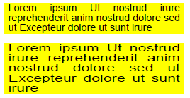
Text can be stretched horizontally with this setting, measured in percent. If the argument is less than 100, then all characters are rendered proportionally narrower and the text string will take less space. If it is larger than 100, then the width of all characters will be expanded accordingly.
The example shows the same text justified to the same width, with stretching values of 100 and 150.
pdf = FPDF()
pdf.add_page()
pdf.set_font("Helvetica", size=8)
pdf.set_fill_color(255, 255, 0)
pdf.multi_cell(w=50, text=LOREM_IPSUM[:100], new_x="LEFT", fill=True)
pdf.ln()
pdf.set_stretching(150)
pdf.multi_cell(w=50, text=LOREM_IPSUM[:100], new_x="LEFT", fill=True)
.set_char_spacing(spacing=0)
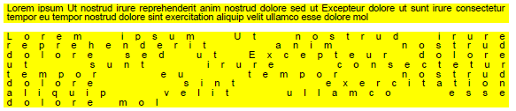
This method changes the distance between individual characters of a test string. Normally, characters are placed at a given distance according the width information in the font file. If spacing is larger than 0, then their distance will be larger, creating a gap in between. If it is less than 0, then their distance will be smaller, possibly resulting in an overlap. The change in distance is given in typographic points (Pica), which makes it easy to adapt it relative to the current font size.
Character spacing works best for formatting single line text created by any method, or for highlighting individual words included in a block of text with .write().
Limitations: Spacing will only be changed within a sequence of characters that fpdf2 adds to the PDF in one go. This means that there will be no extra distance eg. between text parts that are placed successively with write(). Also, if you apply different font styles using the Markdown functionality of .cell() and .multi_cell() or by using html_write(), then any parts given different styles will have the original distance between them. This is so because fpdf2 has to add each styled fragment to the PDF file separately.
The example shows the same text justified to the same width, with char_spacing values of 0 and 10 (font size 8 pt).
pdf = FPDF()
pdf.add_page()
pdf.set_font("Helvetica", size=8)
pdf.set_fill_color(255, 255, 0)
pdf.multi_cell(w=150, text=LOREM_IPSUM[:200], new_x="LEFT", fill=True)
pdf.ln()
pdf.set_char_spacing(10)
pdf.multi_cell(w=150, text=LOREM_IPSUM[:200], new_x="LEFT", fill=True)
For a more complete support of Markdown syntax, check out this guide to combine fpdf2 with the mistletoe library: Combine with Markdown.
Subscript, Superscript, and Fractional Numbers
The class attribute .char_vpos controls special vertical positioning modes for text:
- "LINE" - normal line text (default)
- "SUP" - superscript (exponent)
- "SUB" - subscript (index)
- "NOM" - nominator of a fraction with "/"
- "DENOM" - denominator of a fraction with "/"
For each positioning mode there are two parameters that can be configured. The defaults have been set to result in a decent layout with most fonts, and are given in parens.
The size multiplier for the font size:
.sup_scale(0.7).sub_scale(0.7).nom_scale(0.75).denom_scale(0.75)
The lift is given as fraction of the unscaled font size and indicates how much the glyph gets lifted above the base line (negative for below):
.sup_lift(0.4).sub_lift(-0.15).nom_lift(0.2).denom_lift(0.0)
Limitations: The individual glyphs will be scaled down as configured. This is not typographically correct, as it will also reduce the stroke width, making them look lighter than the normal text. Unicode fonts may include characters in the subscripts and superscripts range. In a high quality font, those glyphs will be smaller than the normal ones, but have a proportionally stronger stroke width in order to maintain the same visual density. If available in good quality, using Characters from this range is preferred and will look better. Unfortunately, many fonts either don't (fully) cover this range, or the glyphs are of unsatisfactory quality. In those cases, this feature of fpdf2 offers a reliable workaround with suboptimal but consistent output quality.
Practical use is essentially limited to .write() and html_write(). The feature does technically work with .cell() and .multi_cell, but is of limited usefulness there, since you can't change font properties in the middle of a line (there is no markdown support). It currently gets completely ignored by .text().
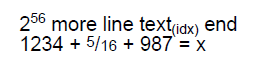
The example shows the most common use cases:
    pdf = fpdf.FPDF()
    pdf.add_page()
    pdf.set_font("Helvetica", size=20)
    pdf.write(text="2")
    pdf.char_vpos = "SUP"
    pdf.write(text="56")
    pdf.char_vpos = "LINE"
    pdf.write(text=" more line text")
    pdf.char_vpos = "SUB"
    pdf.write(text="(idx)")
    pdf.char_vpos = "LINE"
    pdf.write(text=" end")
    pdf.ln()
    pdf.write(text="1234 + ")
    pdf.char_vpos = "NOM"
    pdf.write(text="5")
    pdf.char_vpos = "LINE"
    pdf.write(text="/")
    pdf.char_vpos = "DENOM"
    pdf.write(text="16")
    pdf.char_vpos = "LINE"
    pdf.write(text=" + 987 = x")
.text_mode
The PDF spec defines several text modes: 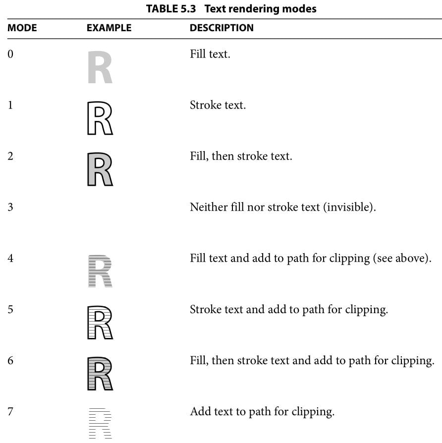
The text mode can be controlled with the .text_mode attribute. With STROKE modes, the line width is induced by .line_width, and its color can be configured with set_draw_color(). With FILL modes, the filling color can be controlled by set_fill_color() or set_text_color().
With any of the 4 CLIP modes, the letters will be filled by vector drawings made afterwards, as can be seen in this example:
from fpdf import FPDF

pdf = FPDF(orientation="landscape")
pdf.add_page()
pdf.set_font("Helvetica", size=100)

with pdf.local_context(text_mode="STROKE", line_width=2):
    pdf.cell(text="Hello world")
# Outside the local context, text_mode & line_width are reverted
# back to their original default values
pdf.ln()

with pdf.local_context(text_mode="CLIP"):
    pdf.cell(text="CLIP text mode")
    for r in range(0, 250, 2):  # drawing concentric circles
        pdf.circle(x=130-r/2, y=70-r/2, radius=r)

pdf.output("text-modes.pdf")

More examples from test_text_mode.py:
markdown=True
An optional markdown=True parameter can be passed to the cell() & multi_cell() methods in order to enable basic Markdown-like styling: **bold**, __italics__, --underlined--, ~~strikethrough~~.
If the printable text contains a character sequence that would be incorrectly interpreted as a formatting marker, it can be escaped using \. The escape character works the same way it generally does in Python (see the example below).
Bold & italics require using dedicated fonts for each style.
For the standard fonts (Courier, Helvetica & Times), those dedicated fonts are configured by default:
from fpdf import FPDF

pdf = FPDF()
pdf.add_page()
pdf.set_font("Times", size=50)
pdf.cell(text="**Lorem** __Ipsum__ --dolor-- ~~sit~~", markdown=True, new_x='LEFT', new_y='NEXT')
pdf.cell(text="\\**Lorem\\** \\\\__Ipsum\\\\__ --dolor-- ~~sit~~", markdown=True)
pdf.output("markdown-styled.pdf")

Using other fonts means that their variants (bold, italics) must be registered using add_font with style="B" and style="I". Several unit tests in test/text/ demonstrate that:
.write_html()
.write_html() allows to set emphasis on text through the <b>, <i> and <u> tags:
pdf.write_html("""<B>bold</B>
                  <I>italic</I>
                  <U>underlined</U>
                  <B><I><U>all at once!</U></I></B>"""
)